

Maroon vs Burgundy: What's the Difference Between These Colours?
You are scrolling through an online store and two dresses catch your eye. One is listed as maroon. The other is listed as burgundy.
In the product photos, they look almost the same shade of deep red. Zoom in and you still cannot spot a real difference.
So what actually separates maroon vs burgundy? The short answer: maroon and burgundy are closely related deep red shades, but fashion brands do not always use the two names to mean exactly the same colour.
Colour names in clothing are not standardised the way a paint chart is. A dye batch, the fabric it is applied to, the lighting in a photo shoot, and the screen you are viewing it on can all nudge a shade one way or the other. That is the real reason two "maroon" dresses from two different brands can look noticeably different, and why this comparison needs more than a one-line answer.
Maroon vs Burgundy: Quick Difference
Before going deeper, here is a fast comparison to work from.
|
Feature |
Maroon |
Burgundy |
|
Colour family |
Deep red |
Deep red with wine-like character |
|
Overall appearance |
Often warmer and more brown-toned |
Often deeper and more wine-toned |
|
Visual impression |
Rich, earthy red |
Rich, wine-inspired red |
|
Common fashion use |
Traditional, festive and everyday deep-red looks |
Evening, formal and sophisticated looks |
|
Appearance under lighting |
Can shift toward brown or red |
Can shift toward purple, wine or red |
Treat this table as a general reference point, not a fixed rule. Maroon colour and burgundy colour names overlap constantly across retailers, and the same physical garment can be labelled either way depending on who is selling it.

Brielle Co-ord Set
View Product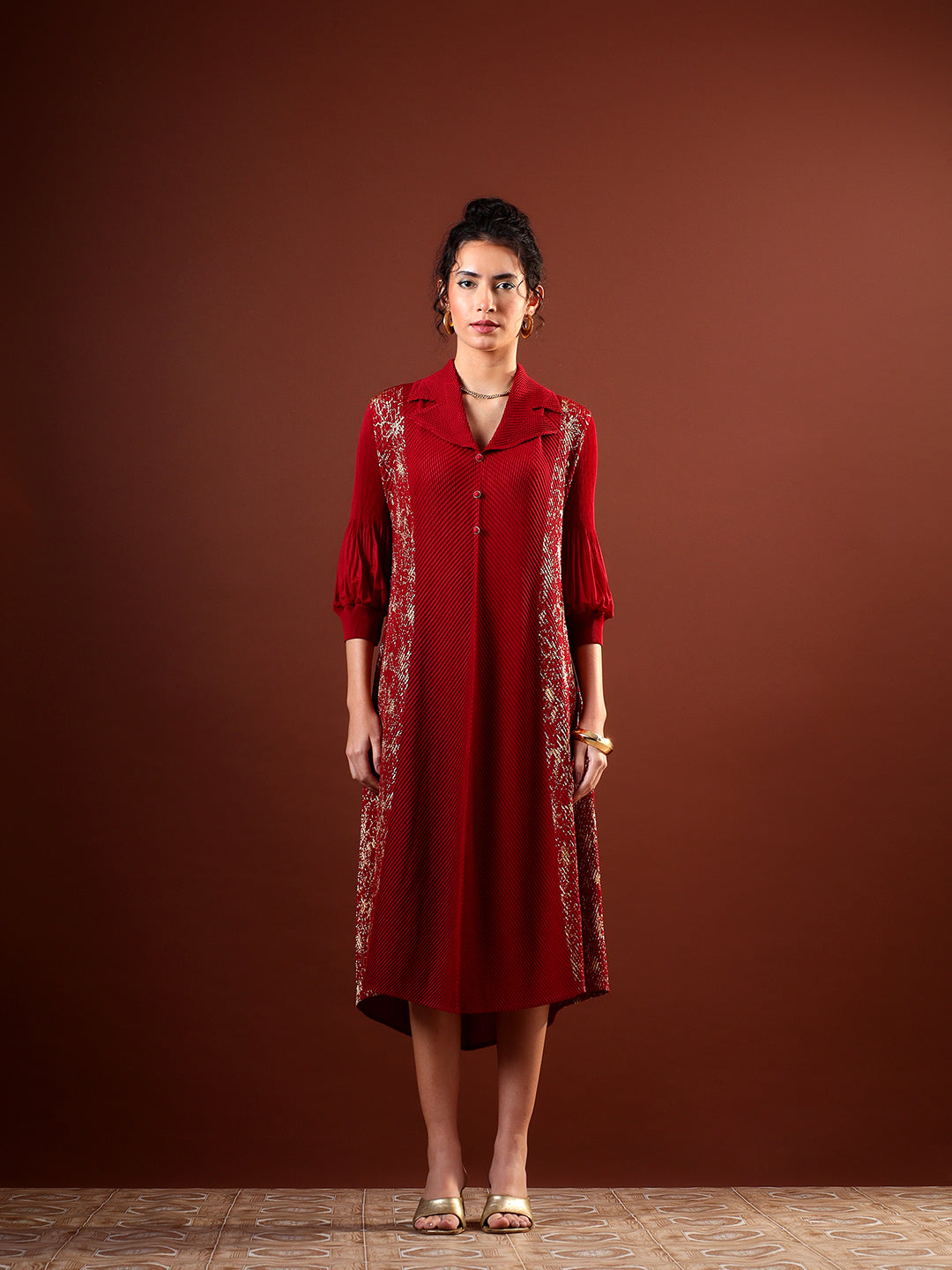
Sephia Pleated Dress
View Product
Seren Sleeveless Midi Dress - Modern Minimalist Chic
View ProductWhat Is Maroon Color?
Maroon color sits in the deep red family, usually with a warm, slightly brown undertone running through it. It is darker than a standard red but not as neutral as brown.
The name itself traces back to the French word marron, meaning chestnut, which is a fairly accurate description of the shade's warm, nutty depth.
Think of the colour of a well-worn leather satchel crossed with red wine that has been diluted just slightly. That warmth is what gives maroon its earthy, grounded feel compared to a brighter red.
The exact shade of maroon shifts depending on what it is applied to. A maroon dyed onto cotton often looks flatter and more muted. The same dye on a fabric with more sheen can look richer and slightly more saturated.
Lighting changes it further. Warm indoor lighting can push maroon closer to brown, while daylight tends to bring out more of its red character. This is exactly why a maroon top that looked one way in a store's fitting room can look different once you are home under a different bulb.
If you ever see a HEX or RGB code attached to "maroon" online, treat it as one digital reference point rather than the definitive version of the colour. Physical fabric, dye batches and screen calibration all mean the maroon you receive may sit slightly warmer or cooler than what you saw on screen.
What Is Burgundy Colour?
Burgundy colour also falls into the deep red family, but its undertone leans toward wine rather than brown. The name comes directly from the Burgundy wine region in central France, home to some of the world's most well-known red wines, and fashion borrowed the name because the shade genuinely mirrors that deep wine colour.
Where maroon can look brownish, burgundy tends to carry a faint purple or wine-like cast, especially in richer or darker versions of the shade.
Fabric changes burgundy just as much as it changes maroon. On satin, the colour catches light and can look almost luminous in places. On a matte fabric like crepe, burgundy reads flatter and more uniform, without those bright highlights.
There is no single "correct" burgundy any more than there is a single correct maroon. Burgundy color as used by one label might sit closer to true wine, while another brand's burgundy might edge closer to maroon. Both usages are common enough that neither can be called wrong.
Difference Between Maroon and Burgundy
This is the section that actually answers the search intent behind difference between maroon and burgundy, so it is worth slowing down here.
Undertone
Maroon usually reads as warmer, with a brownish or earthy undertone sitting underneath the red. Burgundy usually reads as cooler, with a wine or slightly purple undertone. This single difference in undertone is often what your eye is picking up on even when you cannot name it.
Depth
It is tempting to say burgundy is always darker than maroon, but that is not a safe rule. Depth depends heavily on the specific dye formulation a brand uses. Some burgundies are lighter than some maroons. Judge each garment on its own rather than assuming one name always means darker.
Overall Appearance
Maroon tends to read as a warm, grounded deep red. Burgundy tends to read as a richer, wine-inspired red with more presence under evening light. Neither is objectively better; they simply create a slightly different mood.
Fashion Naming
Retailers frequently use maroon and burgundy interchangeably, particularly when a garment's actual shade sits somewhere in the middle. This is not sloppy labelling so much as a reflection of how subjective these colour names have always been in fashion. A dress that one brand calls maroon might appear on another site as burgundy, and both descriptions could reasonably apply to the same swatch.
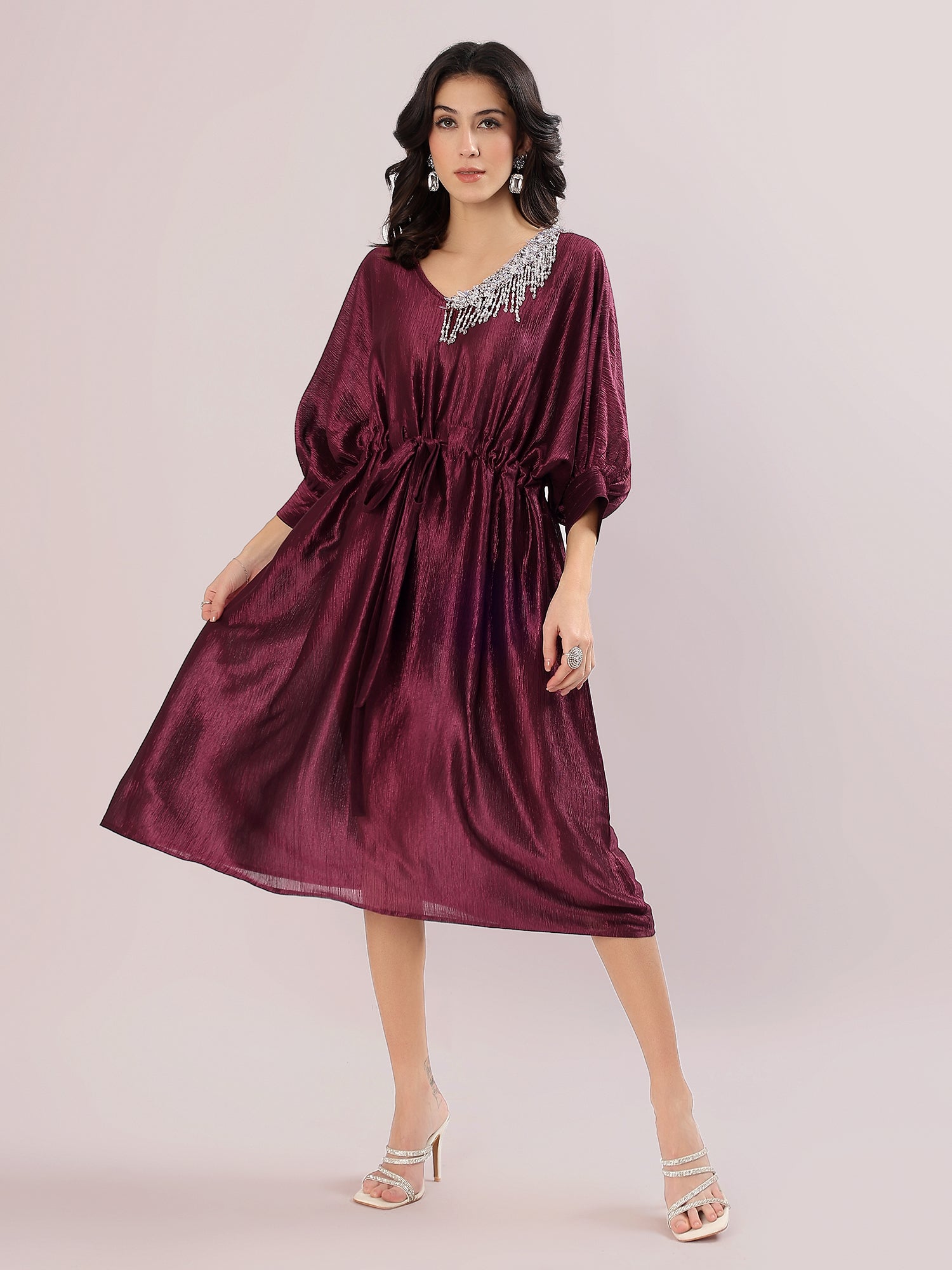
Vayra Dress Chic Party Wear
View Product
Seren Sleeveless Midi Dress
View Product
Lisette Embroidered Set
View ProductIs Maroon and Burgundy the Same Colour?
No, they are generally treated as different colour names, but the line between them is genuinely subjective rather than fixed.
Several factors decide where a particular garment lands:
- Colour naming conventions used by the specific brand
- Dye formulation and how it reacts to the fabric
- The fabric itself, since sheen and texture change how colour reads
- Lighting during photography, which can shift a shade noticeably
- Camera sensor and settings used for product shoots
- Screen calibration, since no two phones or monitors render colour identically
- Retailer naming choices, which are rarely standardised across the industry
This is why a shopper might see the exact same red dye called "maroon" on one site and "burgundy" on another. Neither label is necessarily incorrect. The colour genuinely sits close enough to both categories that reasonable people would name it differently.
How Lighting Changes the Way Maroon and Burgundy Look
Lighting is probably the single biggest reason shoppers get confused between these two shades, more than the dye itself.
In bright daylight, burgundy tends to show its wine-purple character most clearly, while maroon shows its brown warmth more openly. This is usually the most reliable condition to judge a garment's true colour in.
Under warm indoor lighting, such as yellow-toned bulbs common in Indian homes and stores, both colours shift warmer. Maroon can start looking almost chocolate-brown, and burgundy can lose some of its purple edge and read closer to a plain deep red.
Under cool white or fluorescent lighting, burgundy often looks its most vivid and jewel-toned, while maroon tends to stay fairly stable and deep.
|
Lighting condition |
Maroon appears |
Burgundy appears |
|
Bright daylight |
Warm, brownish-red |
Wine-toned, slightly purple |
|
Warm indoor light |
Browner, more muted |
Warmer, less purple |
|
Cool white/fluorescent light |
Deep and stable |
Brighter, more jewel-like |
If you are shopping online, it helps to check product photos shot in natural light where possible, since studio lighting alone can shift either colour noticeably.
Maroon vs Burgundy in Different Fabrics
Fabric changes how any colour behaves, and deep reds like maroon and burgundy are particularly sensitive to this.
Velvet absorbs light rather than reflecting it, which makes both maroon and burgundy look deeper and more saturated. This is part of why velvet is such a common choice for winter and festive maroon or burgundy pieces.
Satin has a natural sheen, so highlights on the fabric can make the same shade look brighter or more vivid in places, even while the base colour stays deep.
Crepe has a controlled, matte finish. Maroon and burgundy on crepe read as clean and understated, without the sheen shifts you get on satin.
Chiffon is lightweight and often layered, which can make maroon or burgundy appear softer or lighter, especially where the fabric is doubled or gathered.
Cotton gives a more natural, less reflective version of either colour, which tends to look truer to the dye without added shine.
Linen can look slightly muted because of its texture and weave, softening the intensity of a deep maroon or burgundy.
The practical takeaway: a burgundy dress will not necessarily match a burgundy swatch card exactly, because the fabric itself is doing part of the work in how the colour finally appears.
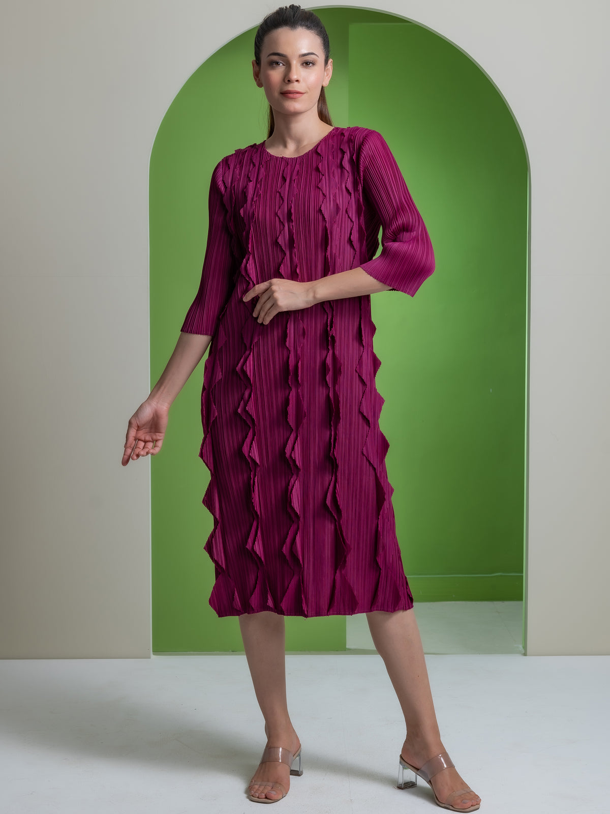
Wine Maroon Colour: What Does It Actually Mean?
Wine maroon colour is a term fashion uses to describe shades that sit somewhere between classic maroon and deep burgundy, leaning toward the richness of red wine.
It is not a scientifically defined colour category. Rather, it is a descriptive label brands use when a garment's shade has both the earthy depth associated with maroon and the wine-like richness associated with burgundy.
This overlap is not a labelling error. It reflects how these three terms, wine, maroon and burgundy, sit close together on the colour spectrum and often blend into each other depending on fabric and lighting.
A good real-world example of this overlap is the Brielle Co-ord Set, where the product is listed in a Wine Maroon shade while its own description calls the colour a deep burgundy. That is not a contradiction. It is simply an honest reflection of how a single garment's colour can genuinely sit across more than one of these naming categories at once.
Maroon Wine: Are Wine and Maroon the Same Colour?

Maroon wine searches usually come from shoppers trying to work out whether "wine" and "maroon" describe the same thing when they see both terms used for what looks like one shade online.
They are related but not identical. Wine as a colour term generally leans toward the deep red-purple of red wine itself, closer to burgundy's character. Maroon, on the other hand, tends to carry more brown warmth.
In practice, fashion retailers use "wine," "wine maroon," "maroon wine" and "burgundy" fairly loosely for garments that fall in this general deep red zone. The specific label chosen often comes down to brand style rather than a strict colour rule, so it helps to look at the actual product photos and, where available, close-up fabric shots rather than relying on the name alone.
Difference Between Maroon and Brown Colour
The difference between maroon and brown colour is one of the more practical questions here, because the two can genuinely be mistaken for each other in low light.
Maroon primarily reads as a deep red. Even when it looks dark, there is usually a visible red cast if you look closely, particularly in natural light.
Brown primarily reads as an earth tone. It leans neutral, without the reddish character that defines maroon.
They can look similar because of a few overlapping factors: low or warm lighting flattens colour differences, dark fabrics absorb light and appear more neutral overall, some maroons genuinely carry strong brown undertones, and screen displays can compress subtle colour differences into something that looks nearly identical.
A simple visual check: if the colour still shows a noticeable red character under good lighting, it is likely closer to maroon. If the red largely disappears and the shade reads as earthy or neutral, it is probably closer to brown. This is a helpful guideline rather than a scientific test, since individual dye batches vary.
Maroon vs Burgundy vs Wine vs Brown
Putting all four together in one place makes the distinctions easier to hold onto.
|
Shade |
Usually Reads As |
Common Visual Character |
|
Maroon |
Deep red |
Warm, rich, sometimes brown-toned |
|
Burgundy |
Deep wine red |
Rich, darker, sometimes slightly purple |
|
Wine |
Deep red-purple/wine family |
Variable depending on usage |
|
Brown |
Earth-toned neutral |
Less visibly red |
These four names are best understood as overlapping colour categories rather than fixed points on a single, universal fashion colour chart. Different brands will place the same physical shade into different boxes, and that is simply how colour naming in fashion has always worked.
Maroon Colour Dress Materials
If you already know you want a maroon colour dress, the fabric you choose will shape how the colour actually reads on you.
Velvet deepens maroon and gives it a rich, almost saturated look, which is why it is a popular choice for evening and winter wear.
Satin brings out brighter highlights along the fabric's folds, giving maroon a slightly more polished, reflective quality.
Crepe creates a cleaner, more understated appearance, letting the colour sit quietly rather than drawing attention through sheen.
Chiffon softens maroon, making it feel lighter and more romantic, especially in layered silhouettes.
Georgette behaves somewhat like chiffon but with a bit more body, giving maroon a soft drape without losing structure.
Silk gives maroon a natural, subtle sheen that feels luxurious without being as high-shine as satin.
Cotton keeps maroon looking natural and consistent, useful for daytime or casual pieces where you want a truer, flatter version of the colour.
Linen mutes maroon slightly because of its texture, which can work well for relaxed, warm-weather styling.
No single fabric is objectively the best choice. It depends on whether you want maroon to look deep and dramatic, soft and romantic, or clean and understated.
How Maroon Looks in Different Types of Dresses
The silhouette a maroon dress is cut into changes how formal or casual the colour feels.
In midi dresses, maroon reads as versatile, working for both daytime events and evening occasions depending on the fabric.
In maxi dresses, the colour gets more room to flow, which tends to push the look toward a more relaxed, festive feel.
In evening gowns, maroon in a fabric like satin or velvet takes on a formal, dramatic quality suited to weddings and galas.
In shirt dresses, maroon feels considerably more casual, especially in cotton or linen.
In co-ord sets, maroon works well because the matching top and bottom let the colour carry the whole look without competing patterns.
In cocktail dresses, a fitted maroon silhouette in satin or velvet reads as polished and evening-appropriate.
In festive dresses, maroon pairs naturally with the richer textures and metallic accents common in Indian festive wear.
In winter dresses, maroon in heavier fabrics like velvet or wool blends feels seasonally appropriate and warm in tone.
How Burgundy Looks in Women's Fashion
Burgundy tends to carry a slightly more formal, evening-oriented character than maroon, though the overlap between the two is real.
In evening dresses, burgundy in satin or velvet looks especially rich once the lighting dims, which is part of why it is a recurring choice for after-dark events.
In cocktail dresses, a fitted burgundy piece reads as sophisticated without needing heavy embellishment to do the work.
In formal dresses, burgundy sits comfortably alongside black and navy as a deeper, less conventional option.
In winter outfits, burgundy pairs naturally with heavier fabrics and layering pieces.
In co-ord sets, burgundy gives a coordinated look real depth, particularly in fabrics with some sheen.
In festive styling, burgundy works well with gold and metallic accessories for a look that still feels celebratory rather than plain.
Burgundy is not universally flattering on every undertone or in every setting, and that is worth acknowledging honestly rather than claiming it works for everyone.
Maroon and Burgundy in Indian Ethnic Wear
Since both shades show up constantly in Indian festive and wedding wardrobes, it is worth looking at how they behave outside Western silhouettes too.
In sarees, maroon in cotton or georgette reads as warm and approachable, suited to daytime functions, while burgundy in silk tends to carry more shine and formality, making it a common choice for evening receptions.
In lehengas, maroon in velvet leans toward a classic, bridal-adjacent look because of how the fabric deepens the colour. Burgundy in a fabric with more structure or embroidery work tends to read as slightly more contemporary.
In kurta sets and Anarkalis, maroon generally feels festive and traditional, comfortable for daytime celebrations, while burgundy leans toward evening or more formal ethnic events.
None of this means one colour is restricted to one setting. The distinction is more about mood than any strict rule, and plenty of women wear either shade across both daytime and evening occasions successfully.
What Colours Go With Maroon?
Certain pairings bring out different sides of maroon.
Black creates a controlled, sharp contrast that keeps maroon looking formal rather than casual.
Cream softens maroon and gives it a warmer, more approachable feel.
Ivory works similarly to cream but reads slightly more formal, useful for festive or wedding-adjacent looks.
Beige creates a quiet, neutral backdrop that lets maroon stand out without visual competition.
Gold brings out maroon's warmth and is a natural pairing for festive Indian occasions.
Champagne adds a soft shimmer that complements maroon's depth without overpowering it.
Blush creates a gentle, romantic contrast against maroon's richness.
Navy pairs two deep tones together for a look that feels considered rather than loud.
Dark green brings out maroon's earthy side, since both colours share a grounded, autumnal quality.
Soft pink softens maroon in a way similar to blush, useful for daytime or spring styling.
None of these pairings work in every context. The right one depends on the occasion, the fabric, and how bold you want the overall look to feel.
What Colours Go With Burgundy?
Burgundy pairs slightly differently because of its cooler, wine-toned character.
Black remains a reliable, formal pairing that lets burgundy carry the colour statement.
Cream warms burgundy up without clashing with its wine undertone.
White creates crisp, high-contrast pairings suited to more structured looks.
Beige gives a neutral base that keeps focus on burgundy itself.
Gold adds warmth and works particularly well for evening and festive settings.
Silver complements burgundy's cooler undertone more naturally than gold does in some cases.
Navy pairs two rich, dark tones for a sophisticated, understated look.
Grey creates a modern, muted contrast against burgundy's depth.
Soft blush softens burgundy for daytime or semi-formal occasions.
Muted green brings out subtle depth in burgundy without competing for attention.
As with maroon, treat these as starting points rather than fixed rules.
Maroon vs Burgundy for Different Occasions
Weddings
Both maroon and burgundy work at weddings, and the right choice usually comes down to the ceremony's time of day and formality. Burgundy in richer fabrics suits evening functions, while maroon works comfortably across both daytime and evening events.
Evening Events
Deeper wine and burgundy tones tend to hold their richness particularly well under evening and artificial lighting, which is one reason they show up so often in eveningwear.
Office Wear
For office settings, more restrained silhouettes in either colour, paired with simpler accessories, keep the look professional rather than overly festive.
Festive Wear
Maroon pairs especially well with gold, ivory and traditional accessories for festive Indian occasions, where its warmth complements the overall styling.
Casual Wear
A simple silhouette in cotton or linen keeps either colour from feeling overly formal, making both wearable for everyday outings.
Does Skin Undertone Matter When Choosing Between the Two?
This is more a matter of general styling preference than a fixed rule, but it can be a useful starting point.
Warmer skin undertones, meaning those with more golden or yellow depth, often find maroon sits comfortably against their complexion because the colours share a similar warmth.
Cooler skin undertones, with more pink or blue depth, sometimes find burgundy creates a more flattering contrast because of its cooler, wine-based character.
Neutral undertones tend to work reasonably well with both, and the final choice usually comes down to personal preference and the occasion rather than undertone alone.
Treat this as a helpful starting point rather than a strict guideline. Plenty of people wear both shades successfully regardless of undertone, and factors like fabric, styling and accessories often matter just as much.
Maroon or Burgundy: Which Should You Choose?
There is no universal winner between the two. The better question is which one suits your specific look and occasion.
Consider your preferred undertone. If you are drawn to warmer, earthier reds, maroon will likely feel more natural. If you prefer a cooler, wine-inspired depth, burgundy is the better fit.
Consider the event. Evening and formal occasions often lean toward burgundy, while maroon comfortably covers both festive and everyday contexts.
Consider the fabric you have in mind. Velvet and satin bring out the richest versions of both colours, while cotton and linen give a flatter, more casual result either way.
Consider the accessories and colours you already own. If your wardrobe leans toward golds and warm neutrals, maroon integrates more easily. If it leans toward silvers and cooler neutrals, burgundy tends to blend in better.
Ultimately, the choice comes down to the specific look you are trying to create rather than one colour being objectively correct. Pieces like a Sephia Pleated Dress in Maroon Red show how the same silhouette can carry either name depending on the exact shade and how the fabric catches light.
Shopping and Care Tips for Maroon and Burgundy Pieces
A few practical habits make it easier to buy and maintain either colour with confidence.
Check the garment in natural daylight before finalising a purchase, either in person or by looking closely at daylight product photos, since indoor lighting can shift the shade noticeably.
Feel the fabric where possible. The same dye will look different on satin versus cotton, so the material is doing as much work as the colour itself.
Follow the care label closely. Deep reds like maroon and burgundy can bleed during washing, especially on richer fabrics like velvet or silk, so dry cleaning is often the safer option for these pieces.
Store both colours away from direct sunlight, since prolonged exposure can fade deep reds unevenly over time.
Frequently Asked Questions
1. What is the difference between maroon and burgundy?
Maroon usually leans warmer with brown undertones, while burgundy leans cooler with wine or slightly purple undertones. Both are deep reds, and the distinction is often subtle.
2. Is maroon darker than burgundy?
Not always. Depth depends on the specific dye formulation rather than the name itself, so some burgundies are lighter than some maroons.
3. Are maroon and burgundy the same colour?
They are generally treated as separate names, but the boundary is subjective and varies by brand, fabric and lighting.
4. What colour is maroon?
A deep red with a warm, often brownish undertone, generally darker than standard red but not as neutral as brown.
5. What colour is burgundy?
A deep red with a wine-like character, often carrying a subtle purple undertone.
6. Is wine colour the same as burgundy?
They are closely related, with wine generally leaning toward the same deep red-purple family as burgundy, though usage varies across brands.
7. What is the difference between maroon and brown?
Maroon retains a visible red character, especially in good lighting, while brown reads as a neutral earth tone without that red cast.
8. Which fabrics look good in maroon?
Velvet and satin deepen and brighten maroon, crepe gives a clean matte look, and cotton or linen offer a more natural, everyday version of the colour.
9. What colours go well with maroon?
Black, cream, ivory, beige, gold, champagne, blush, navy, dark green and soft pink all pair well depending on the occasion.
10. What colours go well with burgundy?
Black, cream, white, beige, gold, silver, navy, grey, soft blush and muted green each bring out a different side of burgundy.
11. Can maroon and burgundy be worn together?
Yes, as long as the two tones are visibly distinct rather than nearly identical. Pairing a clearly maroon piece with a clearly burgundy one, rather than two shades that blur into each other, keeps the combination looking intentional.
12. How are maroon and burgundy different from oxblood or plum?
Oxblood is a deep brownish red that sits close to maroon, while plum leans more purple-brown and sits closer to the darker end of the burgundy family. All four are related deep tones, but each carries a slightly different undertone.


